
Technical curriculum, from needs analysis to a working lab
Generated, then checked by the eval suite. Last read by a person on 2026-09-17, 11 days ago. Its facts were checked by the eval suite on 2026-09-28.
You are assessing whether someone can turn a product's documentation into teachable material, or you want to see a hands-on lab that was chosen by a needs analysis rather than by whatever shipped last.
Open the lab first if you would rather pull a lever than read about one; the reasoning behind it follows.
A customer says Claude is too expensive and names a cheaper model. The rep on the call agrees to look into it. The deal is now a per-token price comparison, and the cheaper model wins that by construction.
The docs page that would have changed that conversation exists, and it is careful. It is written for an engineer running a workload, not for the person on the call. That gap, and not any single fact, is what a technical curriculum is for.
The role
Curate what already exists into structured, reusable curriculum. Build new courses, labs, demos and presentations across the enterprise products, the apps and the API. Keep all of it current as products ship, and make the hands-on parts survive a live classroom of thirty people.
The temptation on a brief like that is to start building on the topic that shipped last week. What follows is the other order. Decide what the audience gets wrong first, then find the source, then build.
Needs analysis
The needs analysis ranks eight areas a go-to-market person could be taught. For each it names the audience and the commercial reason. Foundations and prompting (model tiers, pricing surfaces, thinking effort) is first and for everyone. Competitive positioning is second, for sales. Building on the API, with prompt caching named as the cost lever, is third, for solutions engineers. Agents and MCP, production governance, brand, and vertical overlays follow in that order.
It also fixes the delivery shape: cohorts of six to ten, one level a week, a deliverable per level for each audience. At the API level the technical deliverable is a working prototype that uses prompt caching. The non-technical one is a customer-facing financial model of what caching saves. The lab below is that pair of deliverables on one page.
The inventory
The content inventory holds every page Anthropic publishes (developer docs across three domains, engineering and research posts, cookbooks, courses, the API reference). Each is tagged with the needs-analysis area it serves and scored on three dimensions. The first is how often the topic comes up in a customer conversation. The second is what a wrong answer costs: a deal, trust, a compliance finding. The third is a translation gap.
The first two turn the needs analysis into numbers a script can apply to a page. A topic in the top tier for everyone scores high on both.
The gap is the distance from the source as published to something a go-to-market audience can use. A launch post is 1 and an API endpoint stub is 5, and the gap counts in a topic's favor on purpose. A script rebuilds the inventory, so it can be diffed after every release, and the ranking is a rubric file anyone can argue with.
Why this topic
The top ten rows are one cluster: choosing a model, model IDs and versioning, pricing, and six pages on prompt caching. That is where the first-ranked area (pricing surfaces, thinking effort) meets the third (caching as the cost lever). It is also the one place the analysis asks both audiences for the same deliverable.
Rank 3 in the inventory, Optimizing for cost and intelligence, is the single source that covers all of it, with measured results behind every lever.
It scored 5 on frequency, because cost is the objection on nearly every call. It scored 5 on the cost of a wrong answer, a deal conceded to a cheaper model on the wrong comparison. It scored 3 on the gap: the page is excellent, and it assumes you can run the measurement. The audience needs it, the source is sound, and the distance between them is exactly what a lab closes.
Both audiences
One design requirement outranked the rest. A non-technical person can do everything in the lab, with no caveat.
AI is blurring the line between the person who sells a workload and the person who builds it. In my experience the teams that get the most from Claude are the ones where a rep and an engineer can argue about a cost curve from the same picture. The lab is built to hand them that picture.
Three patterns carry the rule. The arithmetic is drawn, not written. The stacked bar is the formula, so cost per solved task is something you see before it is something you compute. That is Mayer's dual-channel and Sweller's cognitive load work, which the learning standard behind this design leans on.
Both tabs render one manifest. Every control on the GUI tab is a field of a real API request on the code tab, under the same name, so the rep and the engineer are moving the same lever.
The third pattern is Knowles: adults learn from the experience they bring. Every go-to-market person has already heard the cost objection, so each scenario opens in the customer's words rather than as an engineering ticket.
Lave and Wenger say learning lives in the group, not the course. A shared vocabulary with a shared set of shapes is the cheapest community I know how to build. The honest limit: whether it shortens a real rep-and-engineer conversation is the measure, and nobody has measured it yet.
The lab
Cost and intelligence is an explorable model of a real Claude workload. You change one lever (turn on caching, lower effort, ask for a shorter answer, switch the model) and watch the pipeline and the monthly bill move. The previous state stays on the chart as a ghost.
It is built for the two audiences a go-to-market program has to serve at once. A non-technical person can do everything on the page. An engineer gets a code tab where the same levers are the fields of a real API request.
Three ways in, sized to the time you have. Look it up, in about 30 seconds: the page's own routing table as a wizard, so you can answer "which lever first?" on the call. Today's card, in 5 minutes: one customer, one question, then the measurement, and you commit before you see it.
Model a workload, in an hour: 12 scenarios, from a support triage agent to a contract clause finder that does not fit in one context window. Each starts in the customer's actual state, with their own quality floor and cost target. Fifteen traps run the experiments the page measured, each as two shapes you switch between rather than a paragraph to remember.
Two design decisions matter more than the rest. Every figure on the page lives in one data file with its source and a verified date. A build fails if prose repeats a value it should have looked up, so a product release means updating data rather than hunting through copy.
The engine also says which of its outputs Anthropic measured and which it interpolated. A setting outside the measured envelope is labeled estimated on every tile. Four of the twelve scenarios are estimated throughout, because the docs never measured those shapes, and the page says so rather than smoothing it over.
The design applies the research on adult learning that changes behavior. There is a real consequence outside the course, the cost brief the rep takes to the next call. There is safe failure with feedback at the moment of decision, and there are no points, streaks or leaderboards, because the evidence on those is not kind.
Open the lab and pull one lever. If you sell, support or build with Claude, I would like to know which scenario is closest to a call you have actually had.
Walkthrough
Eight screenshots of the lab, each with numbered callouts, taken in Chrome at 1100 px wide (Look it up at 880 px, the Code tab at 1440 px, the phone view at 390 px). Where a figure would run long because of repeated rows, the middle is cut out and a tear marks the join. The notes under each figure match its numbers.
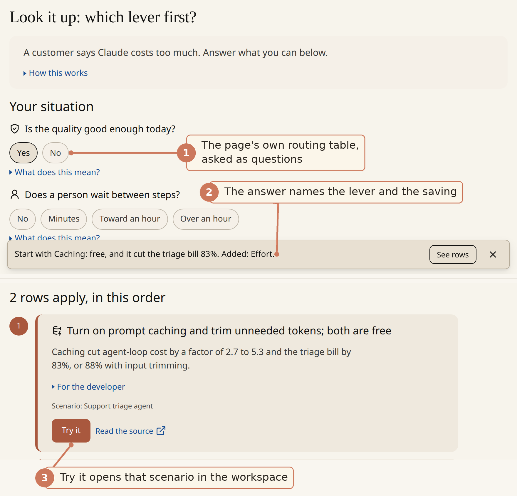
- The questions are the docs page's own routing table, one chip row each; skip the ones you cannot answer.
- The strip answers the heading in one sentence: the lever and the measured saving.
- Try it opens the workspace in the scenario the figure was measured on.
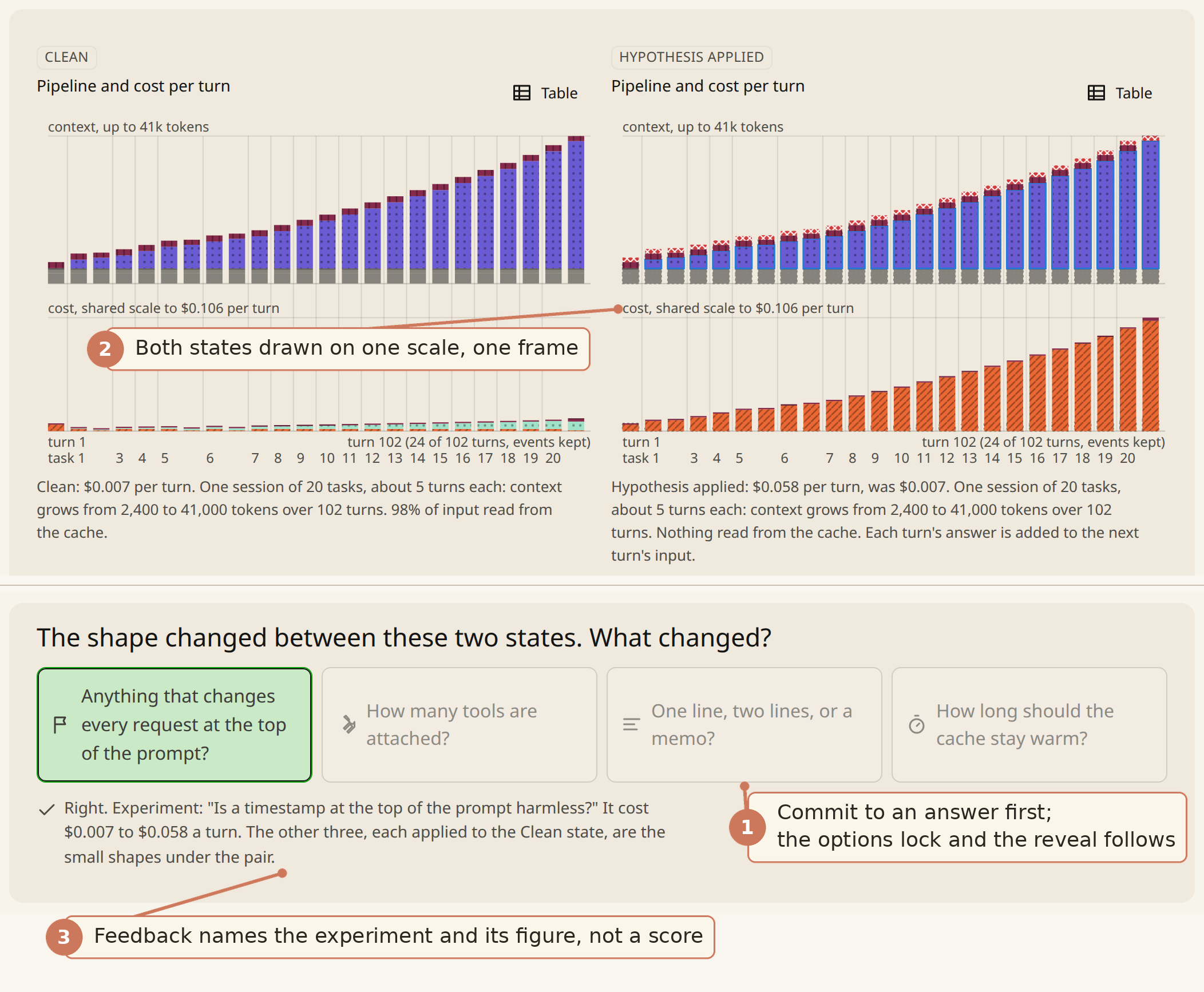
- You predict before you see: the options lock on the commit and the reveal follows.
- Both states share one scale, so the size of the change is the picture, not a number to compute.
- The feedback names the experiment and its measured figure; there is no score and no streak.
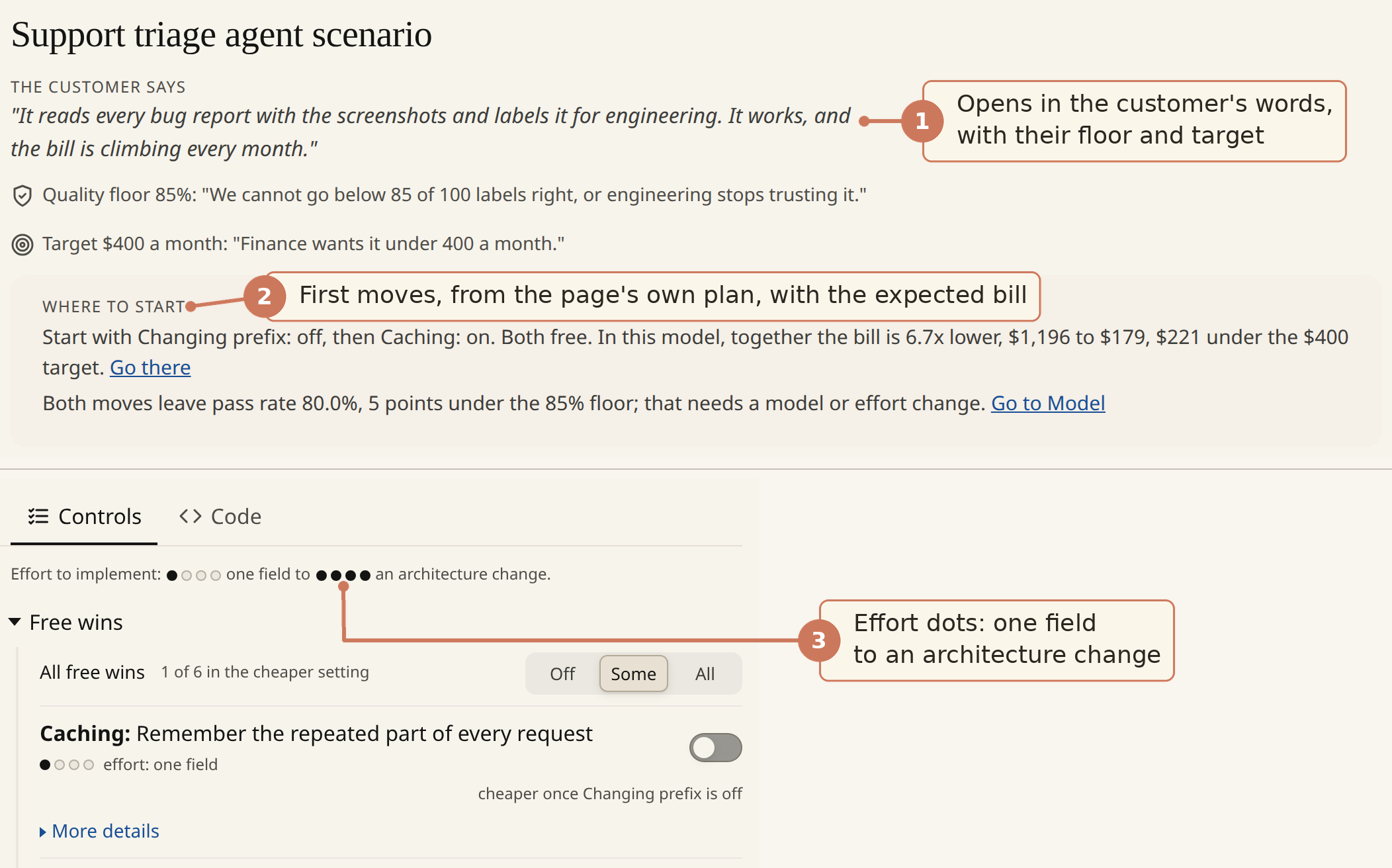
- The scenario opens in the customer's words, with their quality floor and cost target.
- Where to start gives the first moves from the page's own plan and the bill it expects.
- Effort dots under each lever, from one field up to an architecture change.
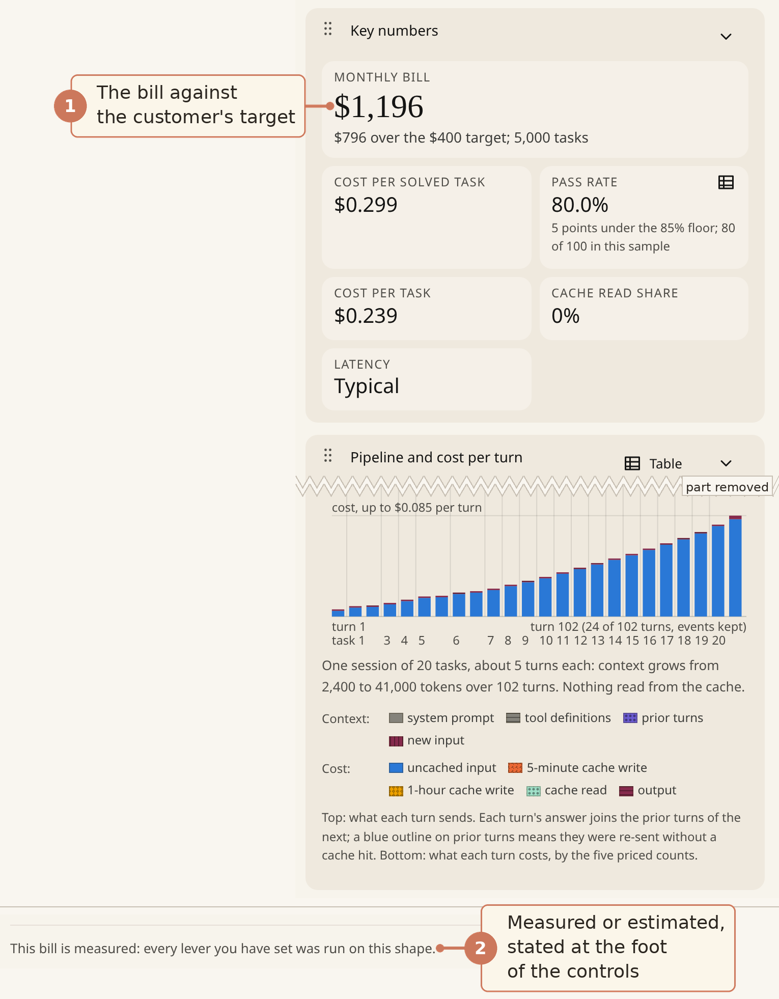
- The bill is shown against the customer's target with the shortfall.
- The line at the foot of the controls (scrolled into view here) says whether the bill is measured or estimated.
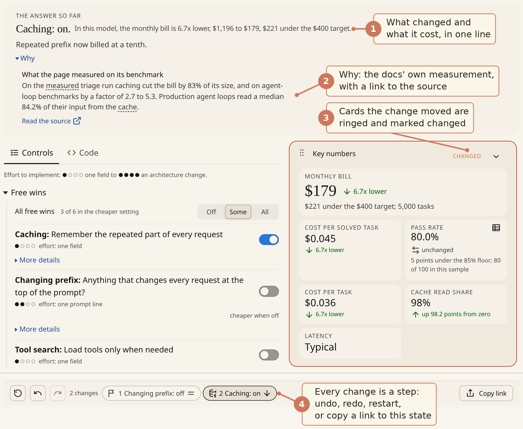
- The answer card says what changed and what it cost, in one line.
- Why quotes the docs' own measurement, with a link to the source anchor.
- Every output card the change moved is ringed and marked changed.
- Each change is a timeline step: undo, redo, restart from the customer's starting state, or copy a link that reopens this state.
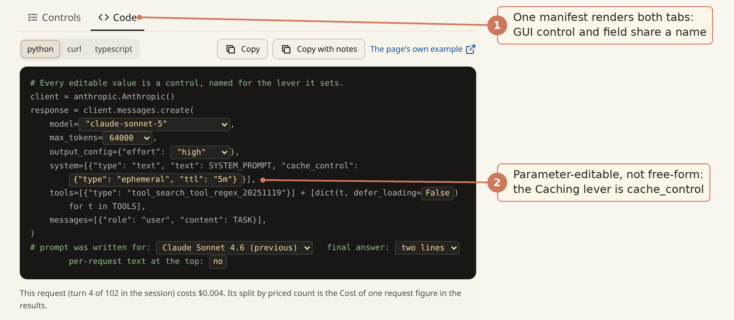
- One manifest renders both tabs, so the GUI control and the request field carry the same lever name.
- Editable values are parameters of a real request, not free-form code; Caching is the cache_control field.
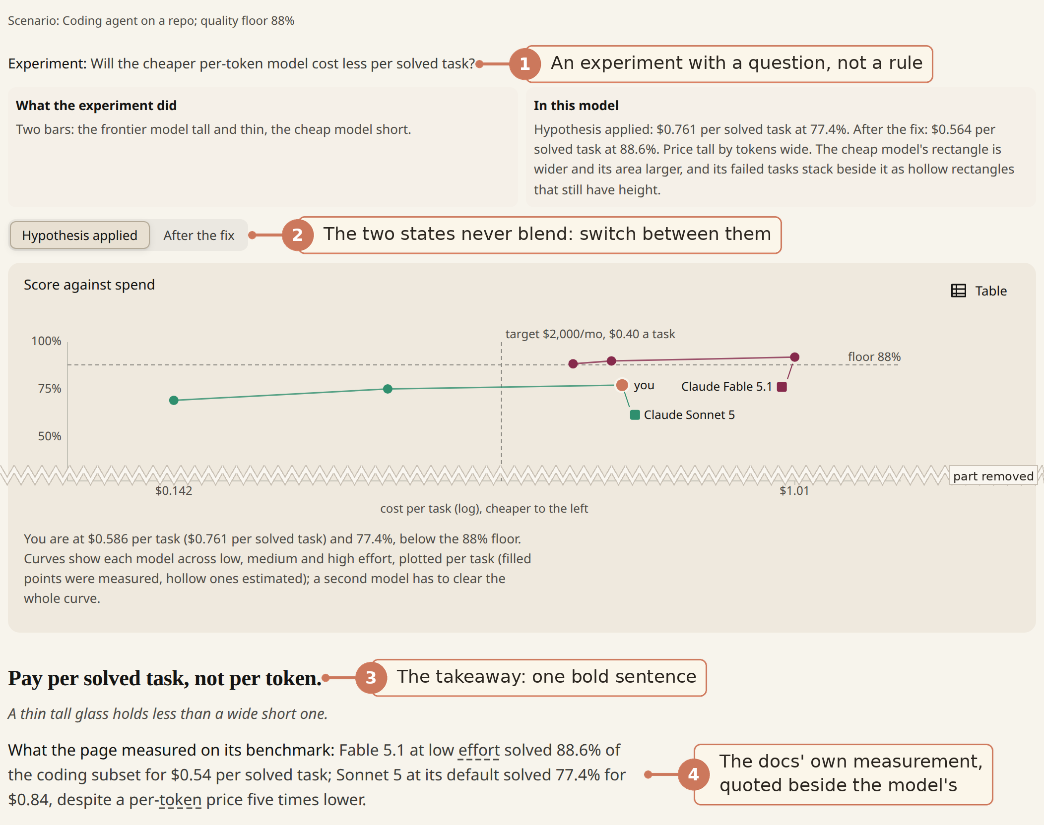
- Each trap is framed as an experiment with a question, not a rule to memorize.
- Hypothesis applied and After the fix are two states you switch between; they never blend into one chart.
- The takeaway is one bold sentence under the chart, so the thing to remember is the finding, not the hypothesis.
- The docs' own measurement is quoted beside the model's figures, each headed by whose run it is.
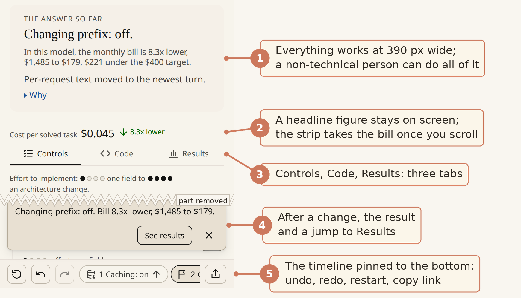
- Everything works on a phone; a non-technical person can do all of it.
- A headline figure stays on screen above the tabs: cost per solved task while the answer card is in view, the bill once the card scrolls away and the strip sticks.
- Controls, Code and Results are three tabs; wide, Results sits beside the controls and the strip has two.
- A change made while Controls is in front lands behind the tab, so a strip at the foot carries the one-line result and a See results button that jumps to the changed card.
- The timeline is pinned to the bottom with undo, redo, restart and a copy-link button.